Discovering Bologna
A Journey Through History, Culture & Innovation
Documentation
Welcome to our enchanting digital journey through time, a uniquely tailored web design project that mirrors the historic evolution and cultural richness of Bologna, one of Italy's most captivating cities. This project is an immersive digital magazine designed to bring the city's past and present to life with an interactive web-based platform.
Our creative endeavor merges state-of-the-art web technologies with the art of storytelling, engaging our users through three distinctive design styles, each representing a significant period in Bologna's rich history and culture. Through the adept application of CSS and JavaScript, we've crafted a digital canvas that effortlessly transitions between the Renaissance period, the 19th century, XXth century and 2000s.
There are six styles: Renaissance, Hippie, Art Deco, Retro, 19th century, and Barbie.
Ulisse Aldrovandi and the Renaissance Style
The "Renaissance Style" in our design takes particular inspiration from the work of Ulisse Aldrovandi, a prominent Italian naturalist, whose legacy includes one of the most comprehensive ornithological texts of the era, "Ornithologiae hoc est De avibus historiae libri 12. Cum indice septendecim linguarum copiosissimo". Printed in Bologna in 1599, this meticulous work beautifully illustrates the Renaissance's pursuit of knowledge and its respect for nature.
Aldrovandi's "Ornithologiae" exemplifies the visual appeal of early printed works, a feature we aimed to capture in our design. The text showcases a balanced, grid-based layout that efficiently organized information—an aspect emulated in our CSS positioning and JavaScript transitions.
Typography is another essential aspect we drew from "Ornithologiae". Aldrovandi's book used a mix of Roman and Italic typefaces, reflecting the variations found in early printed works. We've selected fonts that pay homage to this style, echoing the charm of hand-pressed typesetting.
The decorative elements found in "Ornithologiae", such as the beautiful ornamental initials, intricate borders, and scrollwork, also heavily influence our design. Employing JavaScript interactivity, these elements become dynamic, enriching user engagement.
Moreover, Aldrovandi's work is celebrated for its detailed woodcut illustrations of birds, which added a visual dimension to his scientific descriptions. These artistic features inspire the use of illustrations within our web design, bringing an additional layer of interactivity and fascination.
Finally, the color palette of our Renaissance style, characterized by stark blacks and warm earth tones, mirrors the look of the inks used in Aldrovandi's "Ornithologiae". Strategic splashes of vibrant color pay tribute to the hand-painted details frequently added to these early printed works after the printing process.
In essence, our "Renaissance Style" is a digital homage to Aldrovandi's masterpiece, celebrating the design principles and typographic features that made "Ornithologiae" a landmark in early printing. Through this, users are not just observers but active participants in exploring the profound richness of Renaissance Bologna.
Fonts
The fonts we picked are perfect for a project aiming to capture the aesthetics of the Renaissance era in typography.
Metamorphous: Designed by Sorkin Type, Metamorphous is a medium contrast design inspired by the types of the Italian Renaissance. It incorporates the wedge-shaped serifs and vertical axis that were common in the humanist typefaces of the time, reflecting the fluid, rhythmic forms found in the calligraphy of the era. The bold and somewhat irregular strokes provide a feel of being manually carved, akin to letterforms of early Italian printed books.
The "M" of Metamorphous, with its specific curves, gives a nod to the often intricate capital letters found in texts like Aldrovandi's "Ornithologiae". The font also includes ligatures, a typical feature of the period, further cementing its historical connection.
Rosarivo: Rosarivo is an elegant typeface designed by Pablo Ugerman. It has a strong calligraphic feel, which is appropriate for a project attempting to emulate the look of early printed books. The font also features robust serifs and a strong contrast between thick and thin strokes, which is characteristic of the typefaces used in the Renaissance era.
One of the distinctive aspects of Rosarivo is its italic typeface, which is reflective of the chancery cursive style developed by Italian humanists. This style was widely used in the Aldine Press's publications, a leading printer during the Renaissance.
Rosarivo's calligraphic nature and humanistic traits tie it back to the typography used in Aldrovandi's time, helping to create a design that feels both historical and dynamic.
Pairing these two typefaces, Metamorphous and Rosarivo, with careful attention to kerning, leading, and layout, will certainly help to bring the typographic style of Aldrovandi's "Ornithologiae" into the digital age.
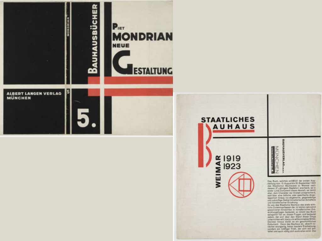
First half of XX century: Bauhaus
The Bauhaus movement, founded in 1919 by Walter Gropius in Weimar, Germany, revolutionized art, design, and architecture in the early 20th century. This interdisciplinary approach aimed to merge fine art with craftsmanship, emphasizing functionality, simplicity, and geometric forms. Here's an exploration of Bauhaus principles, with a focus on your chosen color themes of yellow and red, along with the fonts Bentham (serif) and Futura (sans-serif).
Introduction to Bauhaus:
The Bauhaus movement sought to break away from traditional artistic norms, promoting the integration of art, craft, and technology. It focused on creating functional and aesthetically pleasing designs suitable for mass production.
Principles of Bauhaus:
Designs prioritized functionality without compromising aesthetics. Shapes and structures were simplified to their essential forms.
Geometric Shapes and Patterns:
Bauhaus design heavily utilized geometric shapes like squares, circles, and triangles. These shapes were often arranged in patterns to create visually striking compositions.
Primary Colors:
The Bauhaus color palette primarily featured bold, primary colors such as yellow and red. These colors were used to evoke emotions and create visual interest.
Yellow and red were employed to evoke specific emotions. Yellow symbolized optimism, warmth, and energy, while red represented passion, strength, and vitality.
Fonts used:
Bentham (Serif): The use of a serif font like Bentham conveyed a sense of tradition and elegance, offering a contrast to the modern and geometric aspects of Bauhaus design.
Futura (Sans-Serif): Futura, a geometric sans-serif font, exemplified the movement's emphasis on simplicity and clarity. Its clean lines and geometric shapes suited the Bauhaus aesthetic perfectly.
Reference
History of Layout Design and Modern Newspaper & MagazinesSecond half of 20th century: Retro style in 1990s
The 1990s witnessed a resurgence of retro styles drawing inspiration from various historical periods. This documentation explores the fusion of XIV century aesthetics with the 1990s retro style, particularly in the context of magazines like CineBlitz. The chosen color themes of blue and black, along with the fonts Arno Pro Subhead (serif) and Mostra Nuova (sans-serif), contribute to the unique blend of historical and contemporary design elements
Cine Blitz is a Hindi and English film magazine published every month from Mumbai about Bollywood, Hindi cinema. Started in December 1974, as of 2006, it was one of the top three film magazines in India
The 1990s marked a period of eclectic design, where elements from past eras were reinterpreted and merged with modern sensibilities. The revival of XIV century aesthetics in this decade led to a unique fusion of historical charm with the vibrancy of the 1990s.
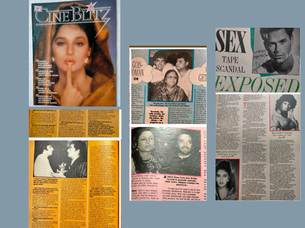
Primary colors:
The use of blue and black in the magazine design evokes a sense of regality, mystery, and sophistication, echoing the color palette of the XIV century.
Fonts used:
Arno Pro Subhead (Serif): This serif font, reminiscent of historical typography, adds a touch of elegance and refinement to the magazine layout.
Mostra Nuova (Sans-Serif): Mostra Nuova, a modern sans-serif font, juxtaposes the serif font, infusing a contemporary vibe into the design while maintaining readability.
Reference
wikipedia page of the Cineblitz magazineFor inspiration of layout and theme
For finding Fonts
For overall Understanding
19th century theme: letter
The design was inspired by 19th letters. Photocopy of letters were found in different archives.
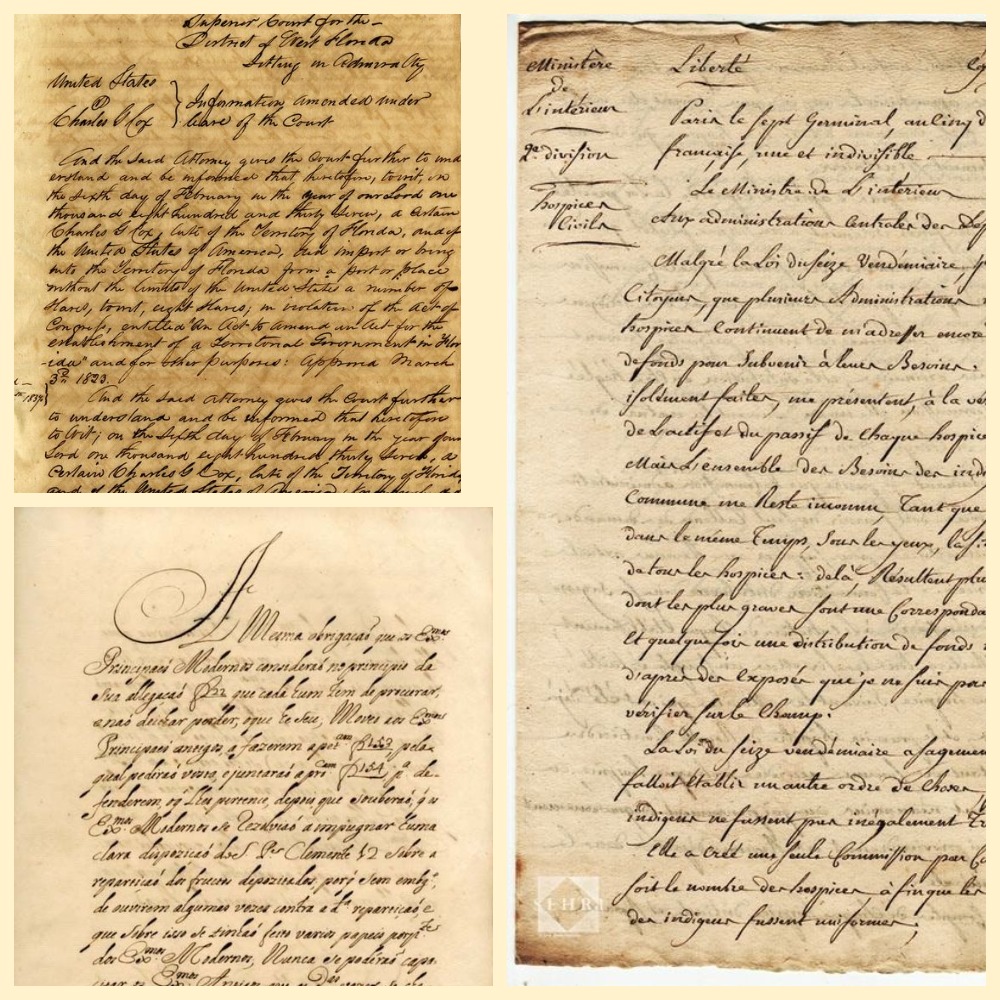
Fonts: Italianno, Monsieur La Doulaise
All letters in the 19th century were written by hand. The style of handwriting varied, but cursive script was common. We used such fonts as Italiannol, Monsieur La Doulaise to make texts look elegant and ornate. All fonts were found in GoogleFonts. They convey a sense of handwritten letters .This evoke the personal touch of a handwritten letter.
Color pallet: #783c00, black, #afa85b,sienna
Letters were typically written on high-quality, heavy paper. That is why it was important for us to use a subdued and classic color palette that reflects the tones of aged paper, such as off-whites, creams, and soft browns. The font color is black because it resembles ink. Also we used background pictures to make an effect of a 19th century table. Thus, a user can feel that he travels to a 19th century cabinet. All of this adds depth and a vintage feel to the website.
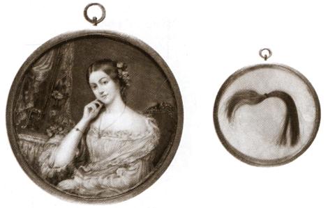
Images
Images were sepia-toned via CSS filter inspired by 19th-century art styles. It maintains a vintage look. Also images are made in a round frame to give them the look of medallion. Medallions were especially popular in the 18th and first half of the 19th centuries, during the era of romanticism.
2000s theme: Barbie video game
Barbie as a fashion doll has been described as the most popular doll in the world. Barbie has become a cultural icon. The Barbie brand is associated with a sense of fun, fashion, and fantasy.
The style was inspired by the old wesites of the Barbie mini video games. Incorporating these elements into the website design we created an engaging and visually appealing experience for visitors, causing a feeling of nostalgia.
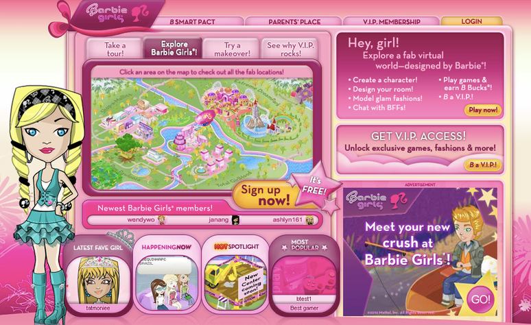
Fonts: Srisakdi, Great Vibes, Emilys Candy
Regrettably, we're unable to utilize the Barbie font due to licensing restrictions. Nevertheless, we've made an effort to identify a comparable font and some playful alternatives featuring hearts to enhance the girlish pink vibe.
Color Palette: #e0218a, white, #e0218a9b
We used a bright and pastel color palette reminiscent of Barbie's signature colors, including pinks, purples, and whites. Also we We integrate images of Barbie doll and gif with glitter.
Hippie Style
The hippie style of the web design is influenced by the iconic psychedelic visuals of the '60s, such as the Beatles' "The Yellow Submarine" album cover. It represents the era's influence on Bologna's cultural scene and gives the design a sense of creative freedom.
Background Design: A psychedelic-inspired pattern serves as the background, emphasizing fluidity and organic shapes.
Color Scheme: The use of forest greens, goldenrods, and saddle browns reflects the naturalistic palette popular with hippie imagery.
Font Selection: The Spice Rice font is used for its unorthodox flair, contrasting with the more restrained Arvo font, which provides a counterbalance of simplicity to the page's headlines and body text.
Mixing Maps, Magazines and Metadata
We use the Bootstrap framework as the basis for the structure and semantic sectioning of our web pages, applying Bootstrap's standard styling to our service pages. Each of our magazine issues has its own default style: Renaissance for the historical issue about Aldrovandi, 19th century handwriting for the tourist issue, and Bauhaus for the feminist issue, and we have three other styles.
Interactive Style Switcher: The “switcher” script allows users to dynamically switch between these styles on any page.
Metadata Collection and Interaction: Each article is enriched with metadata, categorized under 'Persons' and 'Places'. This data is automatically extracted with JS from the HTML markup and displayed in a dedicated metadata section. Interactivity is enhanced through a feature where clicking on an entity in this section automatically scrolls to and highlights its occurrence in the text.
Interactive Map Integration: We utilize geographical data from each referenced location to generate an interactive map of Bologna. This is achieved using the Leaflet package, with the Stamen Watercolor Tile enhancing the map’s aesthetic to align with our site's theme. Each location is marked with a custom marker, providing the name and a brief note explaining its relevance to our content.
Do you like what you see?
Our user-friendly interface allows you to seamlessly navigate between articles and visualize their locations on an interactive map, while our commitment to editorial excellence ensures that every piece is engaging, informative, and accurate. The Discovering Bologna team has meticulously crafted every typographic detail, from font families and sizes to colors, margins, aspect ratios, and captivating images with captivating captions, to truly reflect the graphic theme and ambiance of this captivating city.
Join us on this digital adventure and explore the wonders of Bologna like never before, all from the comfort of your own home. Discovering Bologna: Unraveling the secrets of the city, one story at a time.